i have a 1440p monitor and when i use Lgo4om fullscreen there is lots of unused gui space and the buttons "save QSO" and so are way of to the right
log4om.png (133.05 KiB) Viewed 4898 times
Surely there must be something possible to show there (as an option) example dxcluster or bandmap or propagation.
Its such a waste of space now, with the button unusable far away
i have a 1440p monitor and when i use Lgo4om fullscreen there is lots of unused gui space and the buttons "save QSO" and so are way of to the right
log4om.png
Surely there must be something possible to show there (as an option) example dxcluster or bandmap or propagation.
Its such a waste of space now, with the button unusable far away
Marcel,
That space in the UI for Statistics (F1) tab is used. Depending upon what an OM has provided as data to the INFO Provider (IE: QRZ, HamQTH).
KI5IO wrote: ↑24 Mar 2020, 18:37
That space in the UI for Statistics (F1) tab is used. Depending upon what an OM has provided as data to the INFO Provider (IE: QRZ, HamQTH).
Well there is still a ridiculous amount of space unless a user is running low resolution. But I don't see an easy fix because the program has to work for a wide range of users.
But like most comments in other threads those buttons seem to be misplaced. Unless there are more buttons planned for over in the right, these buttons should be in the QSO entry box.
I personally would like to have the option to turn toolbar buttons on and off which would allow more of them and have modules that could be turned on in this "grey" area. Things like DXCC statistics at a glance,etc.
My 2 cents
Rich
Attachments
2020-03-24_14-26-59.gif (91.43 KiB) Viewed 4869 times
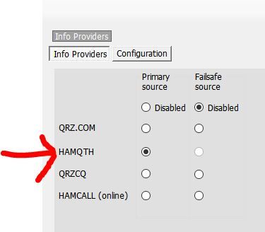
My QRZ.com account is valid, there appears an green oke sign when i check the connection form the settings -> info provider.
The Operator Name field in the QSO entry screen gets populated so there is a valid connection with QRZ (my only info providor)
Also i simplified my password at QRZ so it does not contain any special characters anymore, used to have a strong password
PG8M wrote: ↑19 Apr 2020, 08:43
I have never seen any picture in this grey area,
My QRZ.com account is valid, there appears an green oke sign when i check the connection form the settings -> info provider.
The Operator Name field in the QSO entry screen gets populated so there is a valid connection with QRZ (my only info providor)
Also i simplified my password at QRZ so it does not contain any special characters anymore, used to have a strong password
But still only grey area ?
you must have a subscription on your qrz.com account , or use free hamqth
Please consider this layout. that would solve the the buttons being far away from the action. And you also lose the gray band all along the right side of Log4OM (Free real estate)
PG8M wrote: ↑23 Apr 2020, 17:09
Please consider this layout. that would solve the the buttons being far away from the action. And you also lose the gray band all along the right side of Log4OM (Free real estate)
gui.png
Hello Marcel,
I really like your idea.
Even using the "Send Spot" button would be much more handy than having it on the right side, a little far from the area to which it relates.
We do not know if in the future with the inclusion of new features, it is necessary that the buttons are where they have always been, they may have been placed there for a reason that we do not yet know. However I reaffirm your idea seems to me very interesting.